import seaborn as sns
import matplotlib.pyplot as plt16 Seaborn
(CSE331) Python for Data Science
1 Introduction
Seaborn is a statistical data visualization library for Python built on top of Matplotlib.
It provides:
- High-level, easy-to-use functions
- Beautiful default themes
- Strong integration with Pandas DataFrames
- Many plot types commonly used in statistics
- You work directly with DataFrame columns
- Many defaults are automatically meaningful
- Complex plots require very little code
We import Seaborn as:
2 Seaborn Themes and Style
Seaborn provides clean built-in themes that enhance Matplotlib plots.
sns.set_theme() # Default themeOther options:
sns.set_style("whitegrid")
sns.set_style("darkgrid")
Load the palmerpenguins data
import pandas as pd
penguins = pd.read_csv("data/penguins.csv")
penguins.head()| species | island | bill_length_mm | bill_depth_mm | flipper_length_mm | body_mass_g | sex | year | |
|---|---|---|---|---|---|---|---|---|
| 0 | Adelie | Torgersen | 39.1 | 18.7 | 181.0 | 3750.0 | male | 2007 |
| 1 | Adelie | Torgersen | 39.5 | 17.4 | 186.0 | 3800.0 | female | 2007 |
| 2 | Adelie | Torgersen | 40.3 | 18.0 | 195.0 | 3250.0 | female | 2007 |
| 3 | Adelie | Torgersen | NaN | NaN | NaN | NaN | NaN | 2007 |
| 4 | Adelie | Torgersen | 36.7 | 19.3 | 193.0 | 3450.0 | female | 2007 |
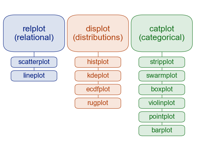
3 The 5 Seaborn Plot Families
Seaborn groups its visualization functions into:
- Relational plots
- visualize relationships between variables
- functions:
scatterplot(),lineplot(),relplot()
- Distributional plots
- visualize distribution of one or two variables
- functions:
histplot(),kdeplot(),displot()
- Categorical plots
- compare categories across numerical values
- functions:
boxplot(),violinplot(),stripplot(),catplot()
- Regression plots
- show relationships + fitted models
- functions:
regplot(),lmplot()
- Matrix plots
- visualize entire grids / correlation structures
- functions:
heatmap(),clustermap()
4 Relational Plots - relplot
- Purpose: Visualize the relationship between two variables.
- Common high-level function:
relplot()→ wrapper for relational plots (scatter or line)
- Individual functions:
scatterplot()lineplot()
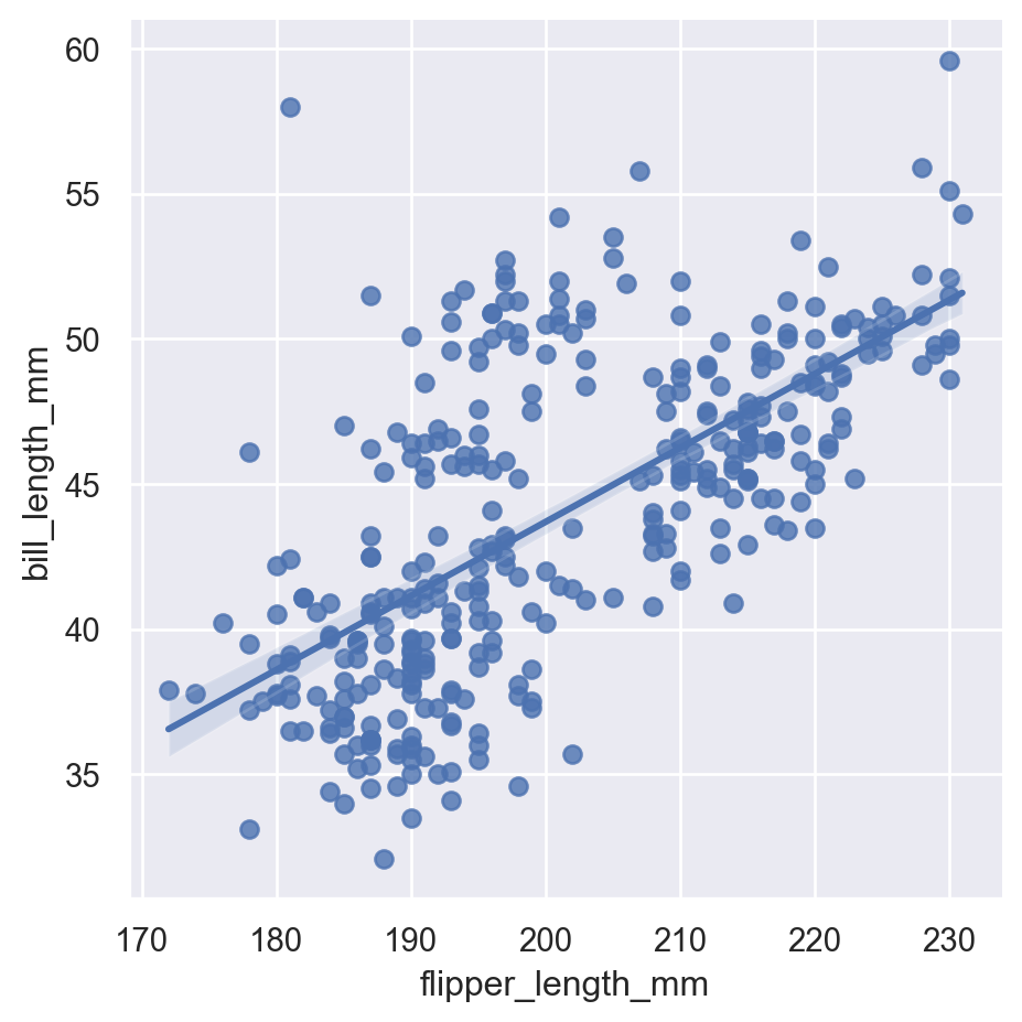
4.1 scatterplot
sns.scatterplot(data=penguins, x="flipper_length_mm", y="bill_length_mm")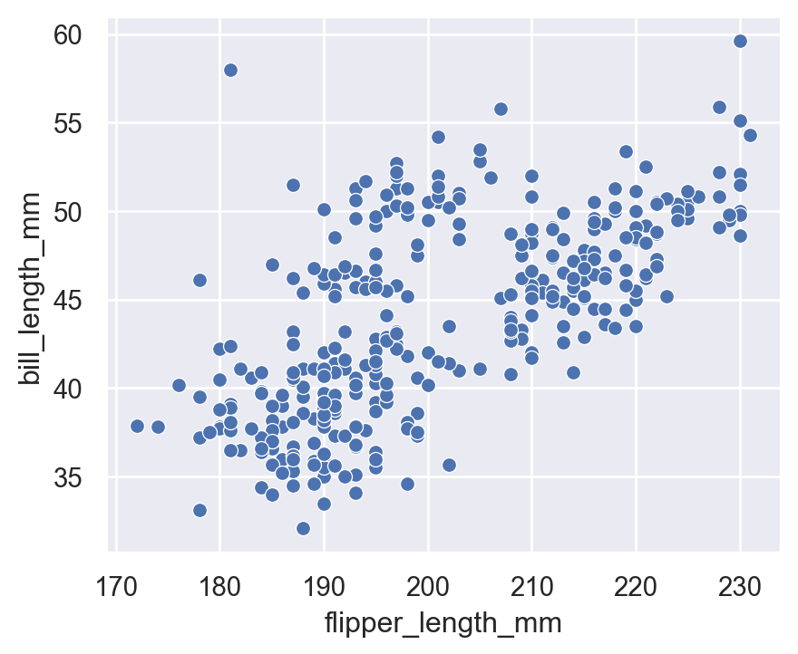
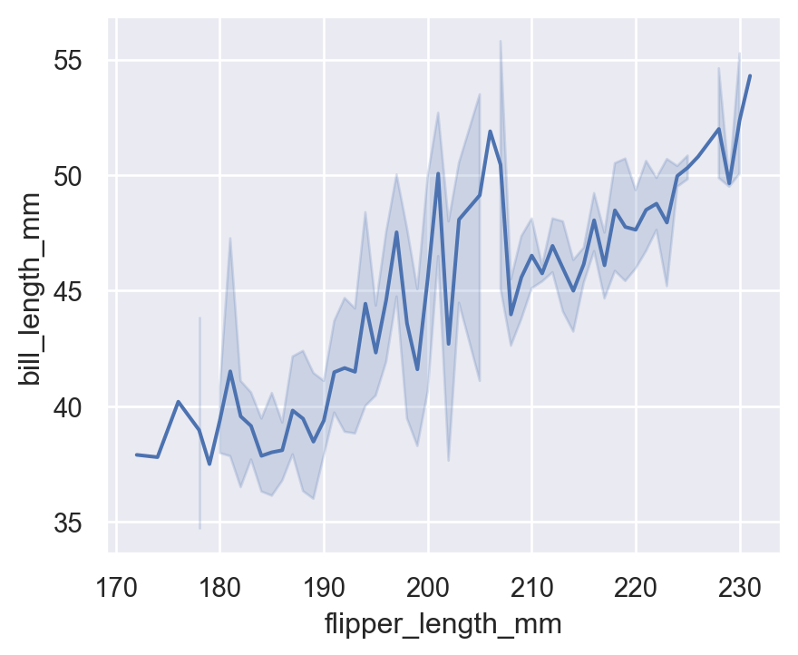
4.2 lineplot
(Not very meaningful for penguins, but for demonstration)
sns.lineplot(
    data=penguins.sort_values("flipper_length_mm"),
    x="flipper_length_mm",
    y="bill_length_mm"
)
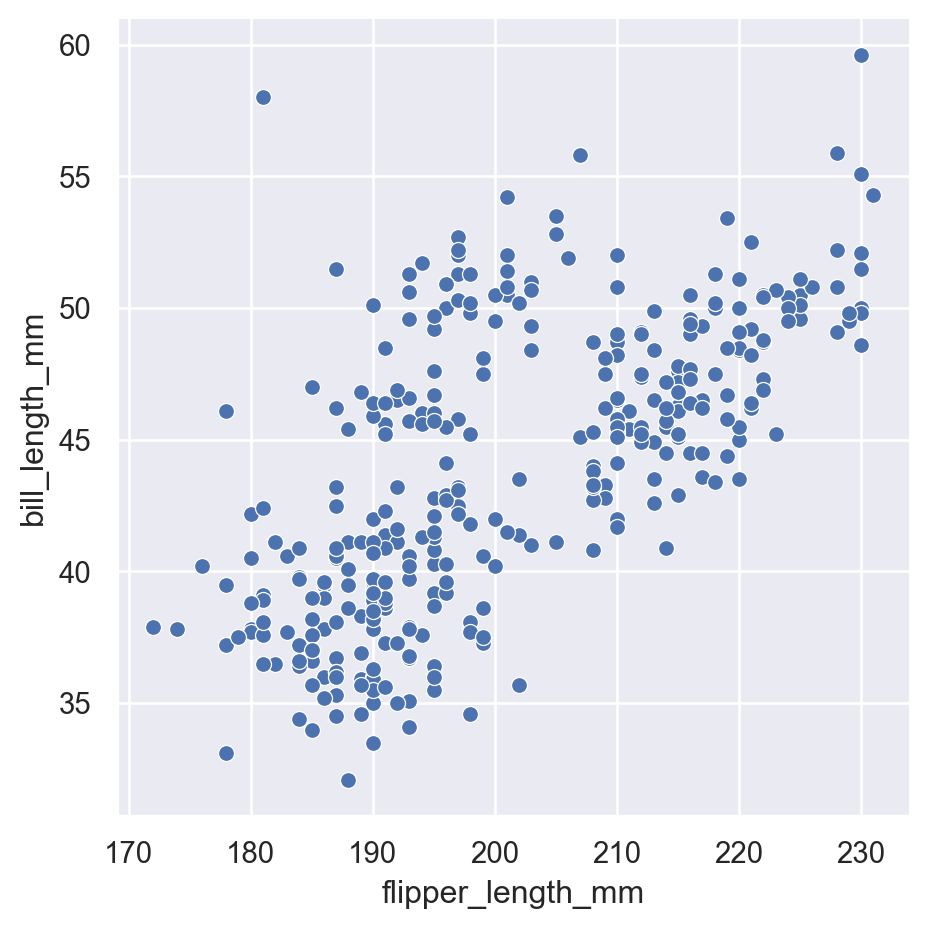
4.3 High-level relplot
sns.relplot(
    data=penguins,
    x="flipper_length_mm",
    y="bill_length_mm",
    kind="scatter"
)
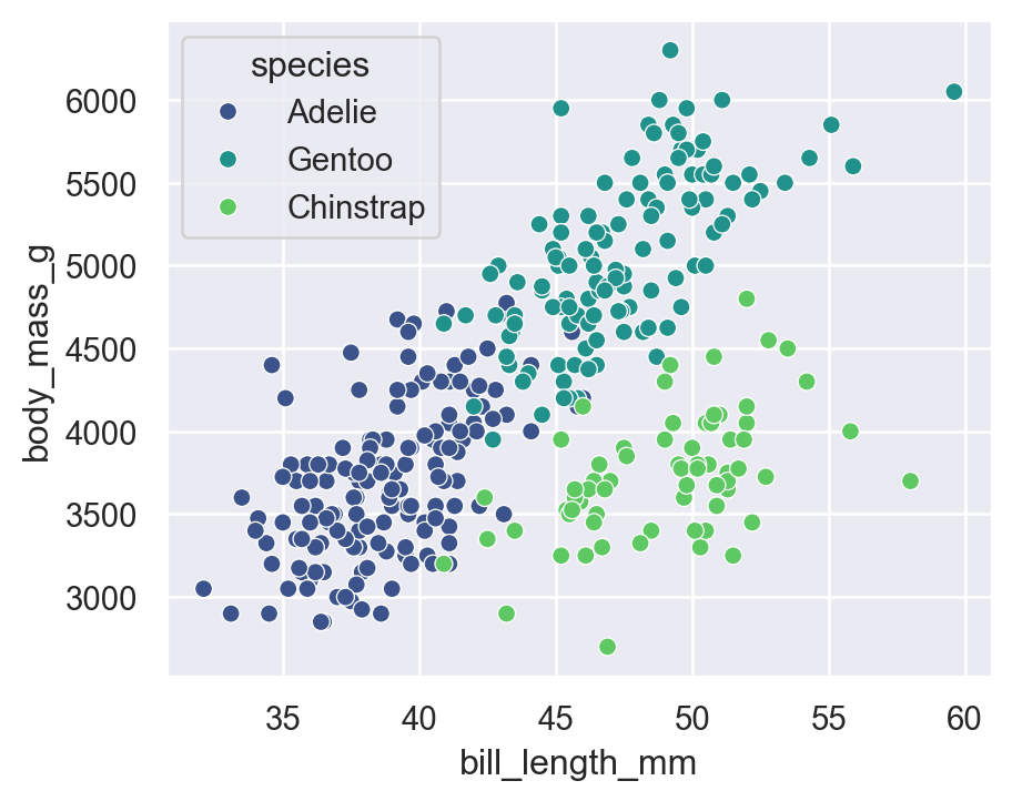
5 Customizing Plots with hue, style, size, alpha, palette
Seaborn allows rich customization of plots using visual encodings. These help communicate more variables through the plot.
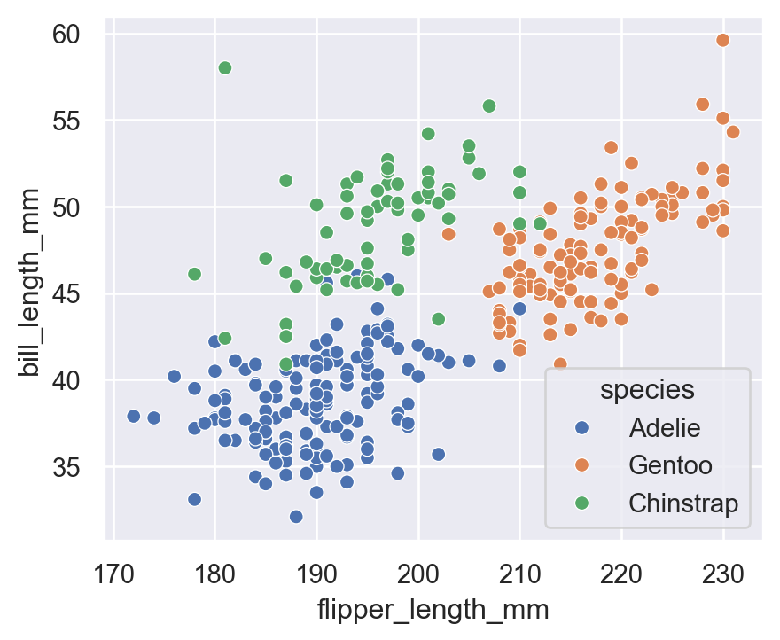
5.1 hue (color by category)
sns.scatterplot(
    data=penguins,
    x="flipper_length_mm",
    y="bill_length_mm",
    hue="species"
)
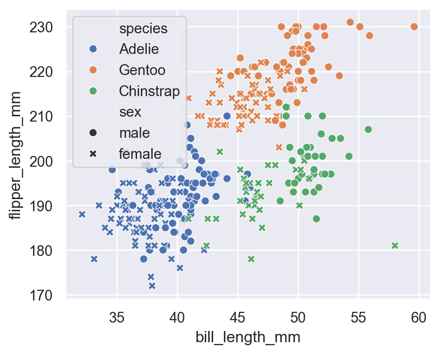
5.2 hue + style (Shape)
sns.scatterplot(
    data=penguins,
    x="bill_length_mm",
    y="flipper_length_mm",
    hue="species",
    style="sex"
)
5.3 size (continuous variable)
Visualizing body mass differences:
sns.scatterplot(
    data=penguins,
    x="bill_depth_mm",
    y="bill_length_mm",
    hue="species",
    size="body_mass_g",
    sizes=(20, 200)
)
plt.title("Adding SIZE to Encode Body Mass")
plt.show()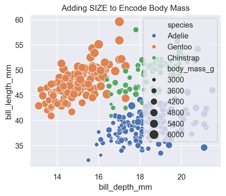
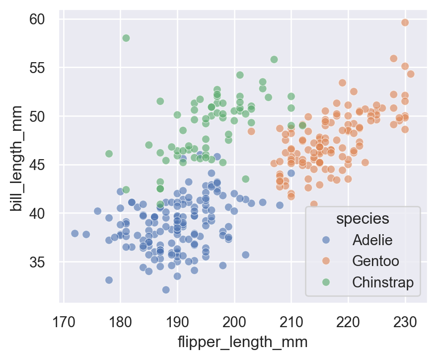
5.4 alpha (Transparency)
Useful for overlapping points:
sns.scatterplot(
    data=penguins,
    x="flipper_length_mm",
    y="bill_length_mm",
    hue="species",
    alpha=0.6
)
5.5 Custom color palette
Seaborn has many beautiful palettes.
Built-in palettes
sns.color_palette()
sns.palettes.SEABORN_PALETTES.keys()
dict_keys(['deep', 'deep6', 'muted', 'muted6', 'pastel', 'pastel6', 'bright', 'bright6', 'dark', 'dark6', 'colorblind', 'colorblind6'])hue + palette
sns.scatterplot(
    data=penguins,
    x="bill_length_mm",
    y="body_mass_g",
    hue="species",
    palette="viridis"
)
Other nice palettes:
"deep""muted""bright""dark""colorblind""pastel""mako""rocket""icefire"
5.6 hue + style + size + alpha + palette
This combines everything into one plot:
sns.scatterplot(
    data=penguins,
    x="flipper_length_mm",
    y="bill_length_mm",
    hue="species",
    style="sex",
    size="body_mass_g",
    sizes=(30, 200),
    alpha=0.7,
    palette="dark"
)
6 Distributional Plots - displot
- Purpose: Understand the distribution of one or two variables.
- Common high-level function:
displot()→ wrapper for histograms, KDEs, ECDFs
- Individual functions:
histplot()kdeplot()ecdfplot()
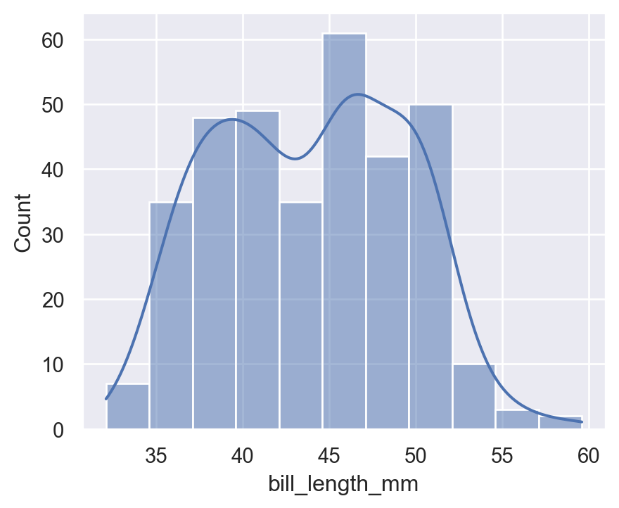
6.1 histplot
sns.histplot(
    data=penguins,
    x="bill_length_mm",
    kde=True
)
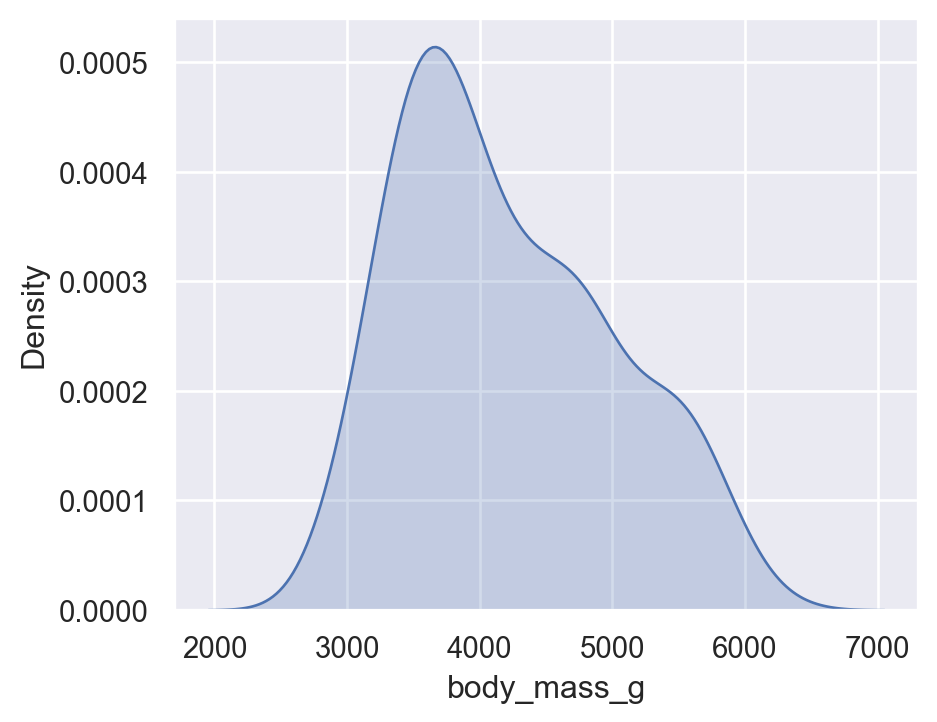
6.2 Kernel Density Estimate - kdeplot
sns.kdeplot(
    data=penguins,
    x="body_mass_g",
    fill=True
)
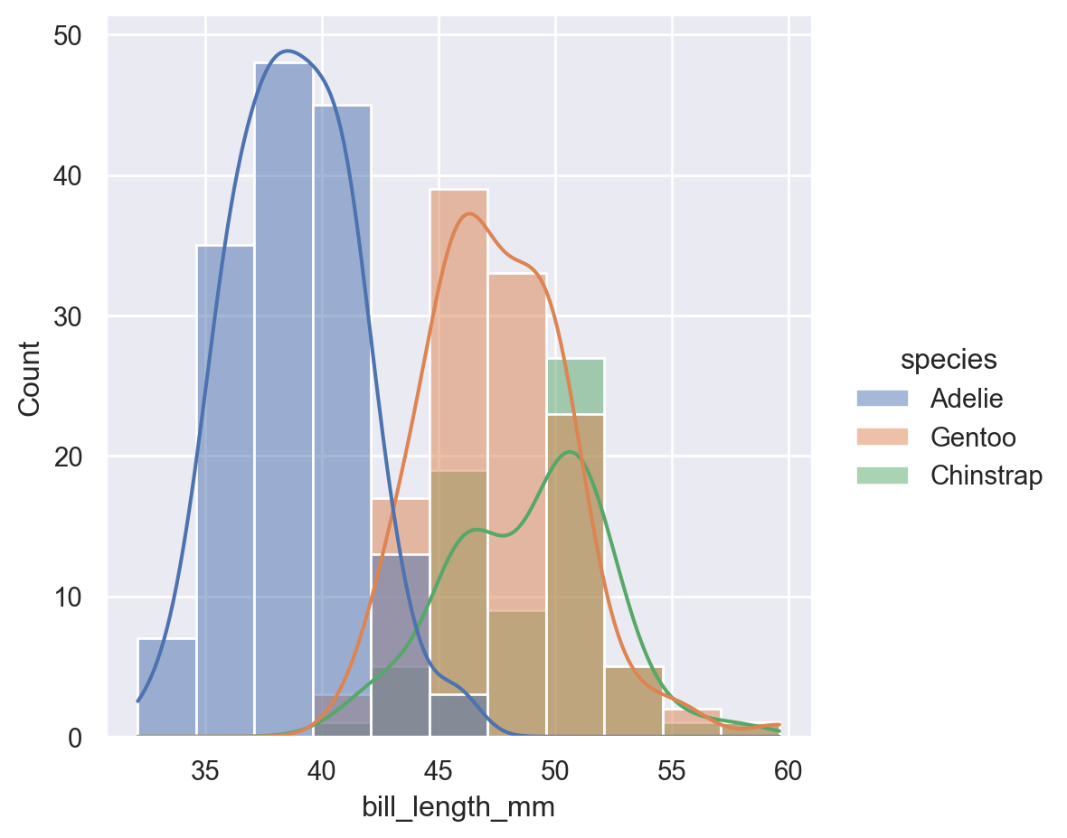
6.3 High-level displot
sns.displot(
    data=penguins,
    x="bill_length_mm",
    hue="species",
    kind="hist",
    kde=True
)
7 Categorical Plots - catplot
- Purpose: Compare numeric values across categories.
- Common high-level function:
catplot()→ wrapper for 8 categorical plot types
- Individual functions:
boxplot()violinplot()stripplot()swarmplot()barplot()countplot()
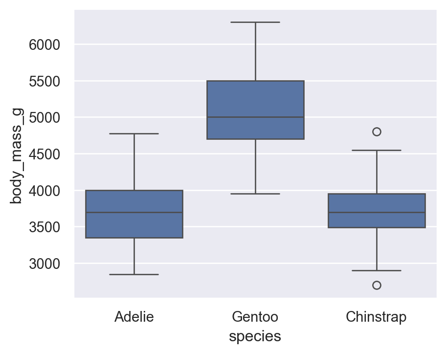
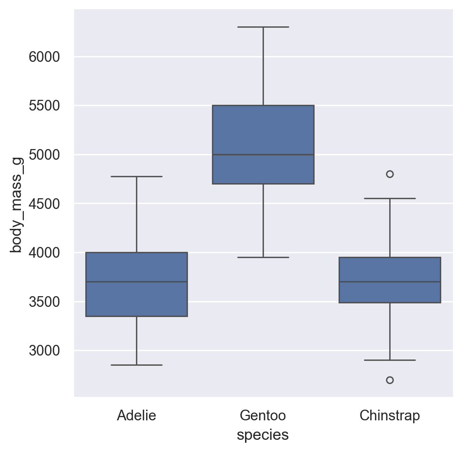
7.1 boxplot
sns.boxplot(
    data=penguins,
    x="species",
    y="body_mass_g"
)
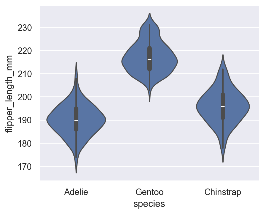
7.2 violinplot
sns.violinplot(
    data=penguins,
    x="species",
    y="flipper_length_mm"
)
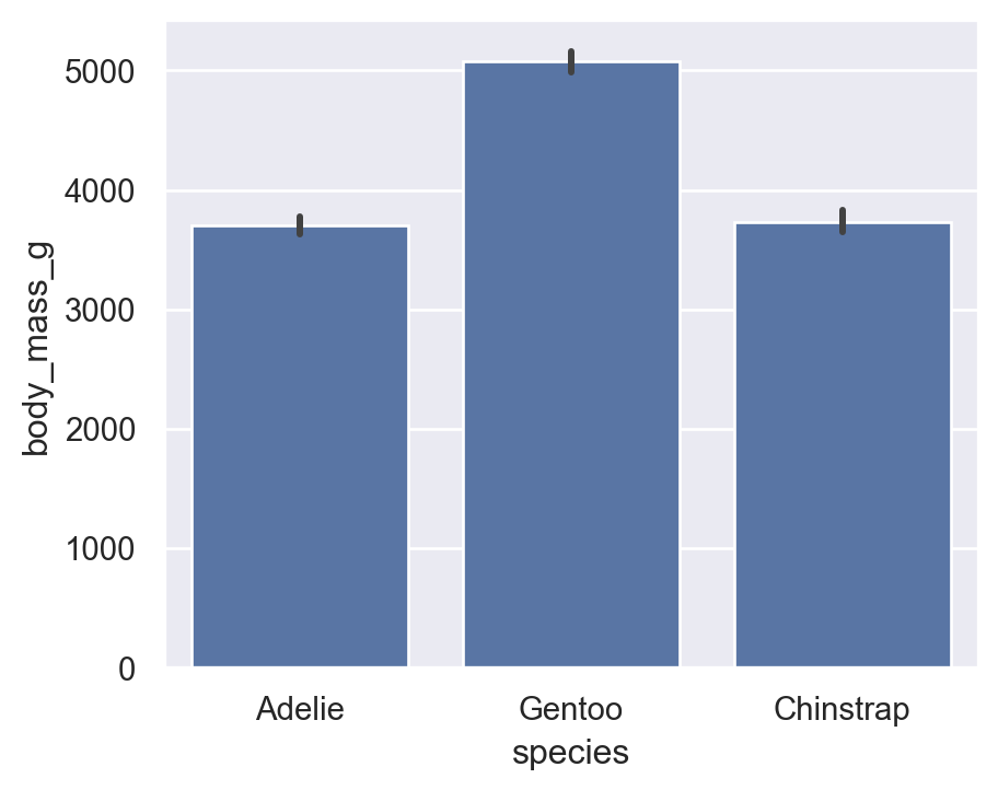
7.3 barplot (Aggregate)
By default, Seaborn shows mean with CI intervals — very useful for statistics.
Average body mass by species:
sns.barplot(
    data=penguins,
    x="species",
    y="body_mass_g"
)
7.4 countplot
For categorical frequencies:
sns.countplot(data=penguins, x="island")
plt.title("Count of Penguins by Island")
Text(0.5, 1.0, 'Count of Penguins by Island')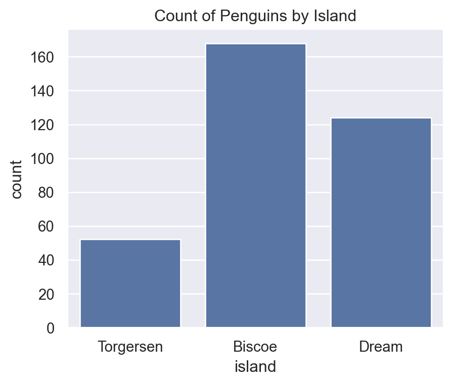
7.5 High-level catplot
sns.catplot(
    data=penguins,
    x="species",
    y="body_mass_g",
    kind="box"
)
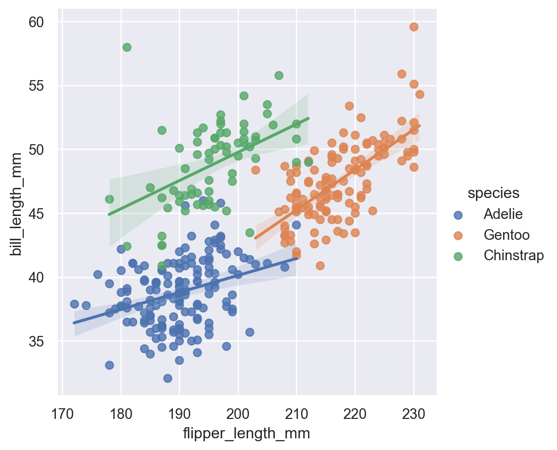
8 Regression Plots
lmplot: Plot data and regression model fits across a FacetGrid.regplot: Plot data and a linear regression model fit.
8.1 lmplot
Equivalent to ggplot2 geom_smooth(method="lm").
sns.lmplot(
    data=penguins,
    x="flipper_length_mm",
    y="bill_length_mm"
)
sns.lmplot(
    data=penguins,
    x="flipper_length_mm",
    y="bill_length_mm",
    hue="species"
)
9 Matrix Plots
heatmap: Plot rectangular data as a color-encoded matrix.clustermap: Plot a matrix dataset as a hierarchically-clustered heatmap.
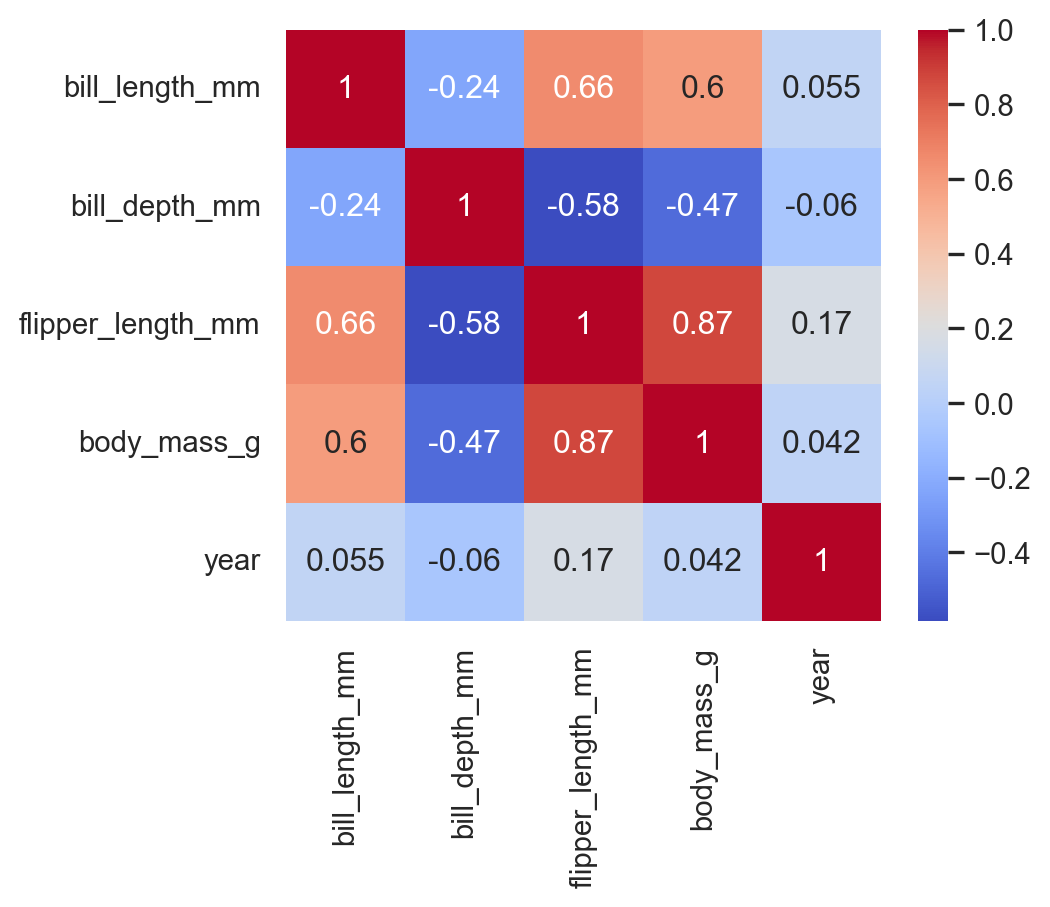
9.1 heatmap
Correlation between numeric variables:
corr = penguins.select_dtypes("number").corr()

sns.heatmap(
    corr,
    annot=True,
    cmap="coolwarm"
)
10 Multi-plot grids
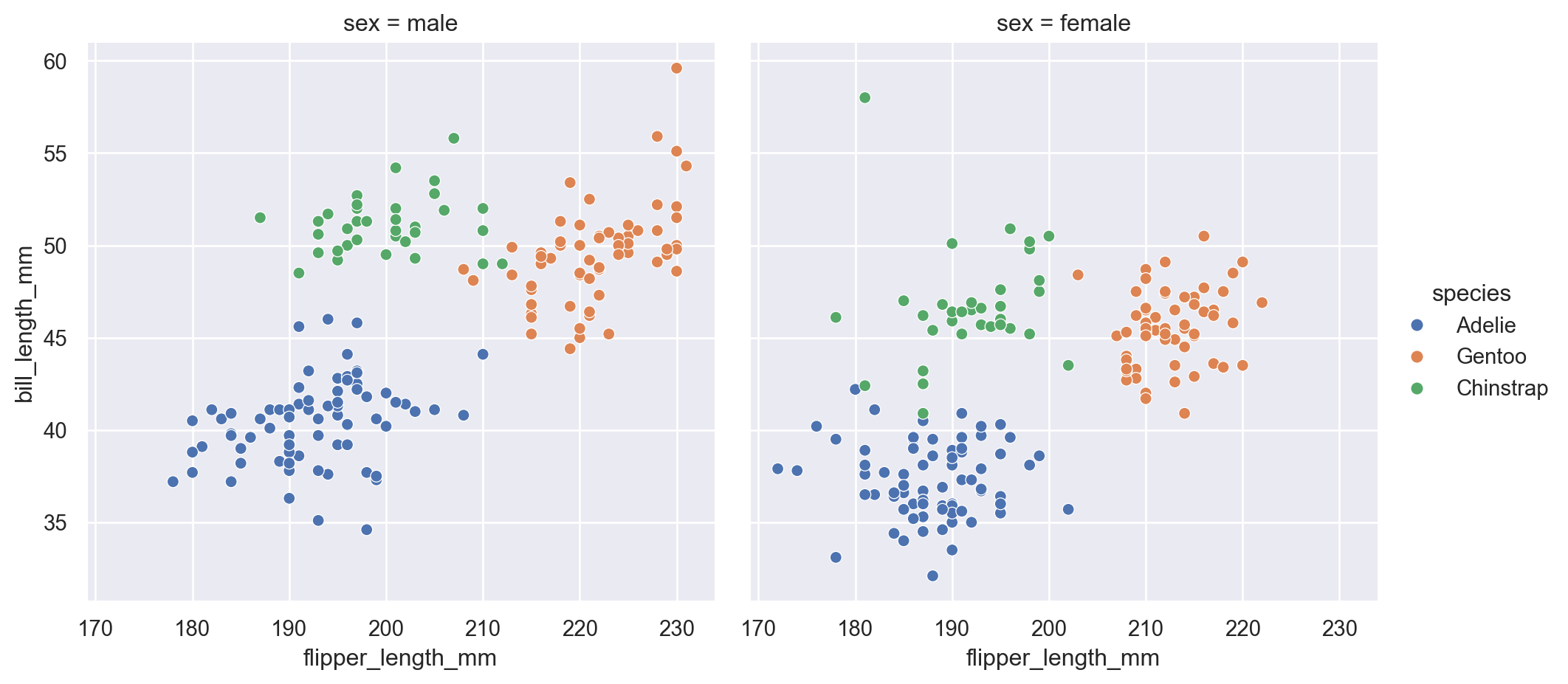
10.1 Faceting with col (Multiple Panels)
The col argument creates separate panels for each category, which helps compare patterns across groups.
sns.relplot(
    data=penguins,
    x="flipper_length_mm",
    y="bill_length_mm",
    hue="species",
    col="sex"
)
10.2 FacetGrid
Faceting by species and sex:
g = sns.FacetGrid(
    penguins,
    col="species",
    row="sex"
)
g.map_dataframe(
    sns.scatterplot,
    x="flipper_length_mm",
    y="bill_length_mm"
)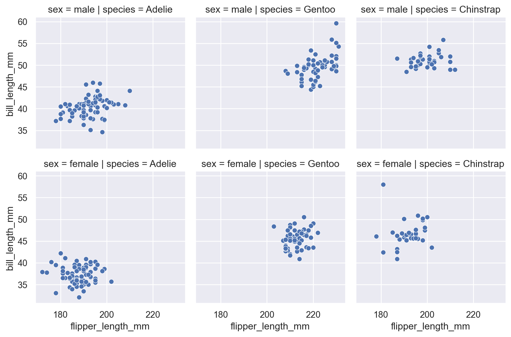
This is the equivalent of ggplot2’s facet_grid().
10.3 pairplot
For multivariate exploration
sns.pairplot(penguins)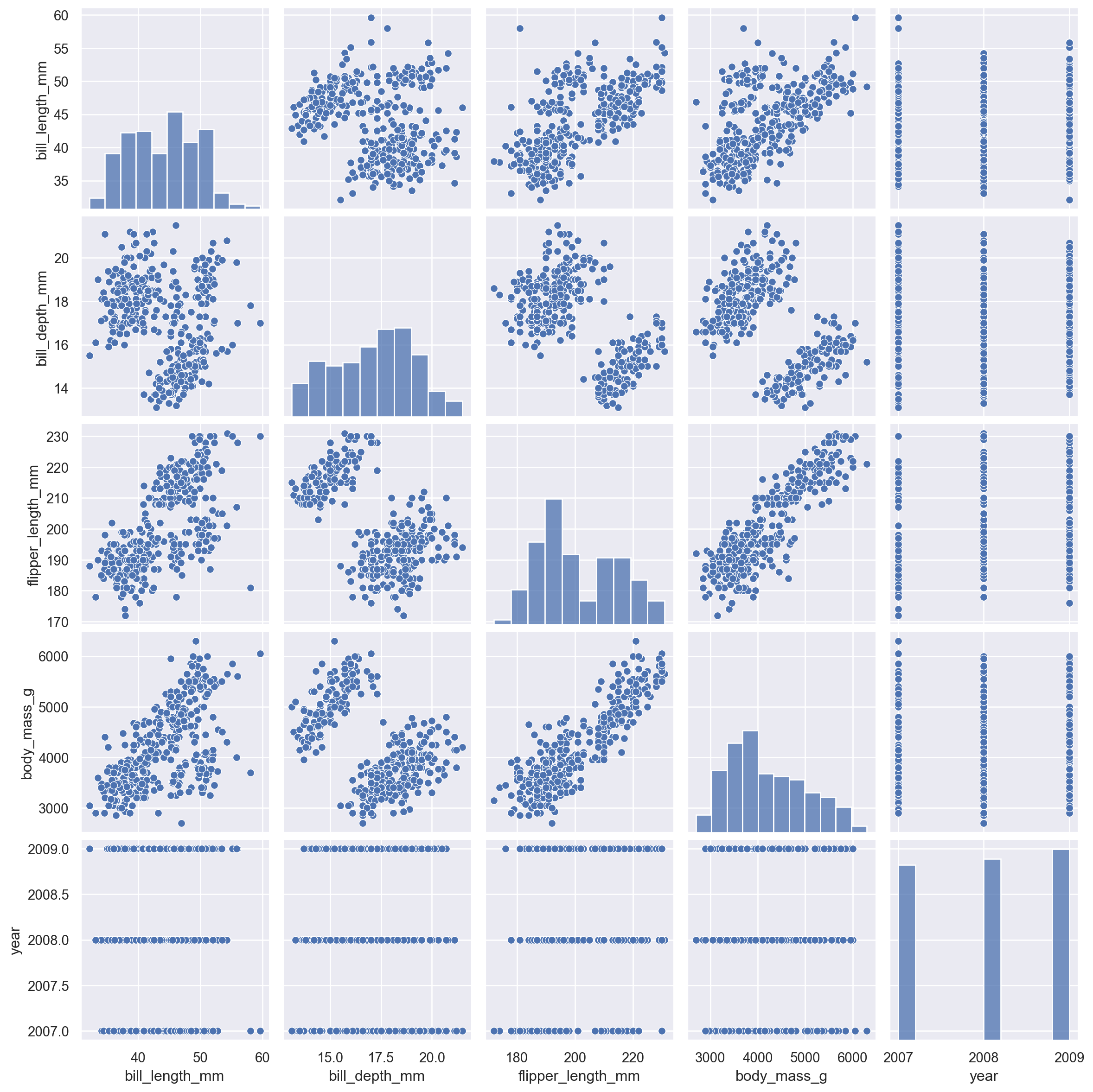
You can also color by category:
sns.pairplot(penguins, hue="species")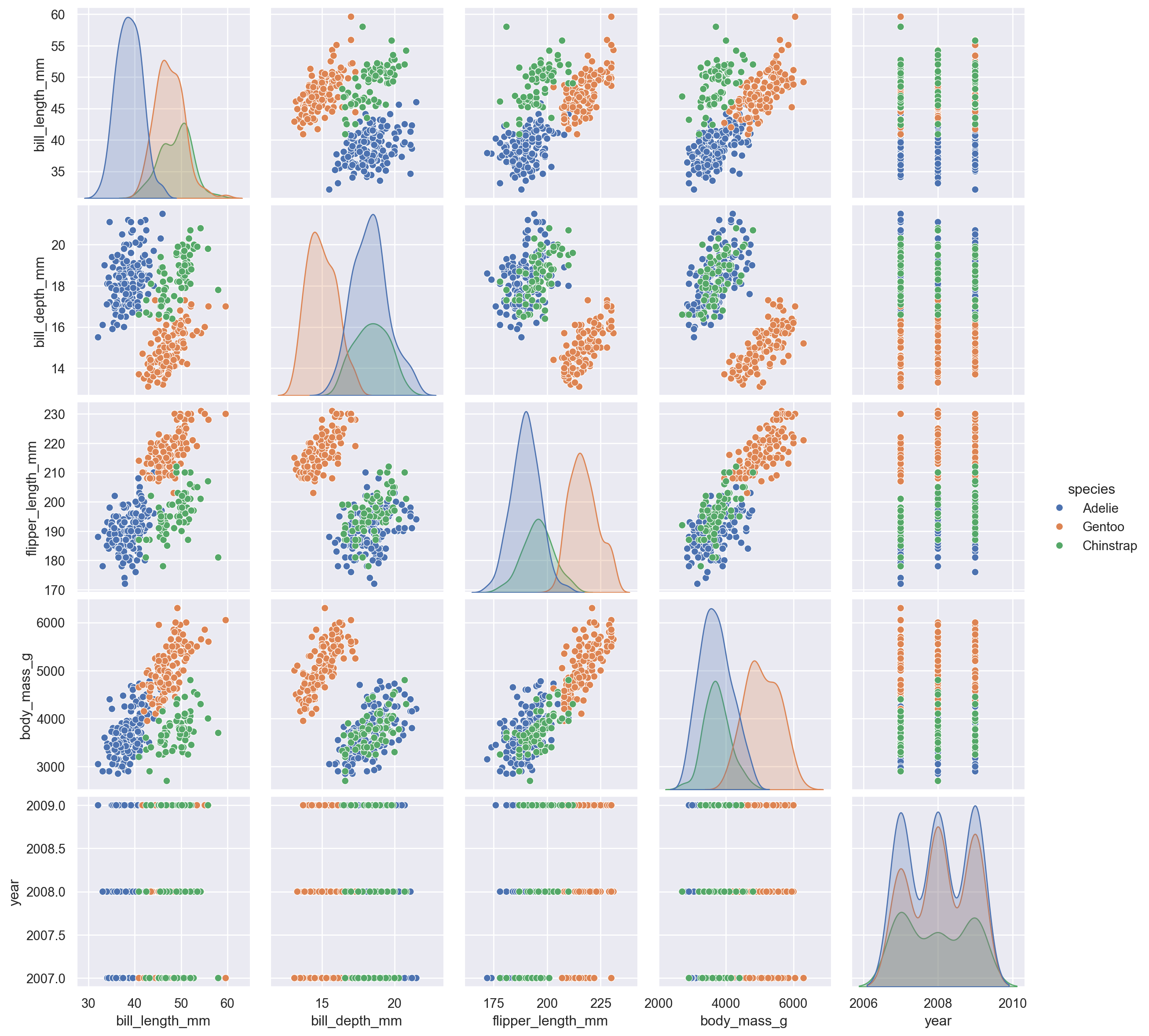
10.4 jointplot
A combination of scatter + distribution plots.
sns.jointplot(
    data=penguins,
    x="bill_length_mm",
    y="bill_depth_mm",
    kind="reg"
)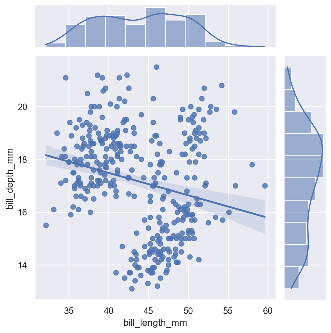
Kinds include: scatter, kde, hist, hex, reg.
sns.jointplot(data=penguins,
    x="flipper_length_mm",
    y="bill_length_mm", hue="species", kind="hist")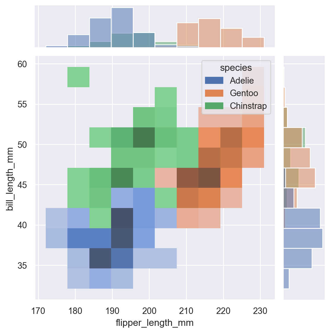
11 Customizing with Matplotlib
Seaborn plots return Matplotlib Axes objects, so customization is simple.
ax = sns.scatterplot(
    data=penguins,
    x="body_mass_g",
    y="bill_length_mm",
    hue="species"
)

ax.set_title("Bill Length vs Body Mass")
ax.set_xlabel("Body Mass (g)")
ax.set_ylabel("Bill Length (mm)")
plt.show()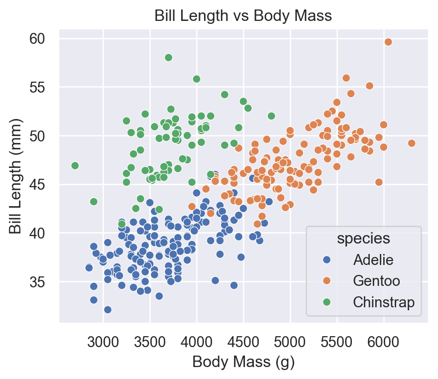
12 Saving Figures
fig = sns.histplot(
    data=penguins,
    x="body_mass_g"
)

plt.savefig("penguins_hist.png", dpi=300, bbox_inches='tight')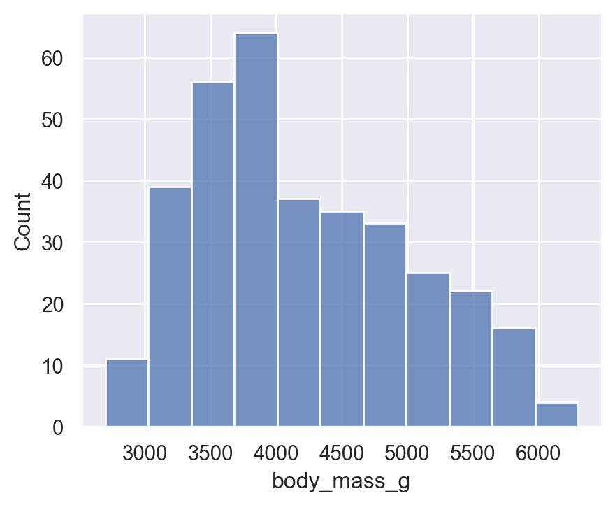
13 Summary
- Seaborn is a high-level statistical visualization library
- Built on top of Matplotlib
- Easy DataFrame integration
- Beautiful defaults and themes
- Excellent for exploratory and statistical graphics
- Faceting, regression plots, heatmaps, distribution plots—all extremely simple
Matplotlib is still needed for fine control, but Seaborn simplifies 80–90% of tasks.